- Home
- Education
- Business and Marketing
- Live Studio Logos
Editors Note: Some images where resized to fit our zine format - some quality was lost. We apologize to Lauren and hope it does not reflect poorly on her.
DESIGNING A GOOD LOGO
Having and using a good logo is important in establishing your identity as an artist....it not only creates a memorable impression of what kind of art you do but encourages a feeling of familiarity and recognition among your patrons. It is often the first impression others have of you and your artwork, make it a good one!
Following certain basic principles can ensure that your logo design is professional, easy to remember and creates a great impact on its viewers while successfully expressing the nature of your artwork
SIMPLICITY
The ideal logo says volumes in the most basic of images...it should be your "essence"....what you are and do, but reduced, strong and succinct. Try to be clever if you can, but not at the expense of clarity. Keep it simple, yet compelling.
BALANCE
Just as in any other form of art, your logo needs balance....line density, shape, arrangement...all are important in reaching a balanced and pleasing logo.
VERSATILITY
Your logo needs to be able to work well at any size and in black and white as well as color....not an easy task! Your logo needs to look as good on your business card as it might on a large sign...and often it is used in strictly black and white instances such as photocopies, newspaper ads, etc.
Of course, being artists, we love color and use it as often as possible...just make sure yourcolor logo can translate easily to black and white.
FORMAT
I have been told It is advisable to always use a vector format, since logo designs done in vector format can be expanded to any size without loss of image quality. Also it is easier to convert a vector logo design into bitmap than vice versa. I personally am computer challanged and still do logos mostly on paper with ink...advice on how to create logos using the computer is something best asked of people who actually know what they are doing.
USE YOUR LOGO!!
Once your logo is ready, start giving it as much exposure as is possible. Not only on your business cards, but also on your packaging, marketing, and all other possible areas. It makes you look professional and credible, even if your studio is a tiny section of your bedroom.
Type faces are, of course, a very important element of the design....there are thousands of fonts to choose from...some are heavy and bold, some light and airy, some vintage looking, futuristic, sleek, cartoony....after a while you will get a feel for the kind of type fact that "speaks" to you. Use it to express yourself, study how type is used in other logos, in magazine ads....book covers, anywhere type is used....each face usually has several versions---bold,light, condensed(squished together so you can fit alot of letters in a small space)and extended(each letter drawn out widely so you can fill up alot of space with just a few letters)italics, and so on... there are also lots of ways to customize typefaces...although you should be probably have some experience before trying to do it manually...there are many ways to manipulate it through software programs though and you can do endless permutations of a typeface once you get the hang of it....like having a beautiful, subtle drop shadow behind them....or a graduated color filling an outlined typeface...the possibilities are endless...but remember, simple is best!!
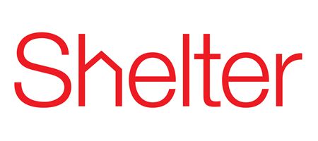
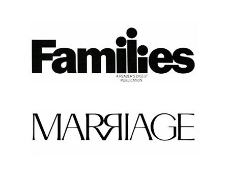
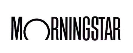
Here are a few examples of very effective logos...they don't represent artists or artwork, but you can apply what you learn from logos like these to your own...a good designer usually looks at tons of reference for inspiration...so logo hunting is a good place to start....

You can find online a number of "create your own" logo software programs...like this one http://www.logoyes.com
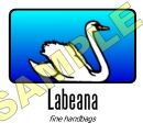
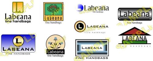
try it...it's a great way to move things around and get a feel for possibilities....and if you love what you create, you can always pay the fee and stop there....but I like it as a tool to play with....then take those ideas and go from there..... using a program like this one, I created a number of "logos" to show you some good ideas and some bad ones....let's start with the bad ones.....here are a group of logos that at first glance might seem ok, but then you start to ask...hmm...what does a swan, or a rabbit have to do with fine handbags? a tad simplistic but i wanted you to see them....


So now that we know what NOT to do...here are some that show you how different a logo can look depending on the typeface and layout you use....
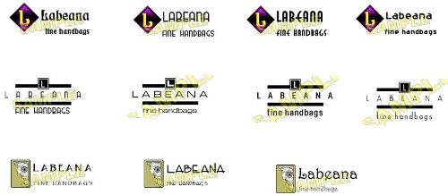
.....and I haven't even begun to add pertinent images of actual handbags.....but these can give you just an idea of the many ways you can manipulate typeface, layouts, etc in your search of the perfect logo....
Once you have something you like, print it out in different sizes and see how it works for you.....
I'm going to stop using labeana as an example because I'm still working on that one lol...but here are some layouts for two different logos...one is for a painter and the other for a photographer....these are just a few ways you can go...
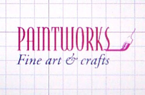
here are some examples of different typefaces and a paintbrush symbol.....I finally come up with something that I like...using the paintbrush to make it look like it has "painted" the word paintworks......
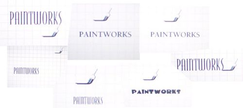
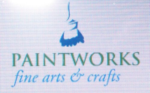
I like this one even better----
here is another alternative.....
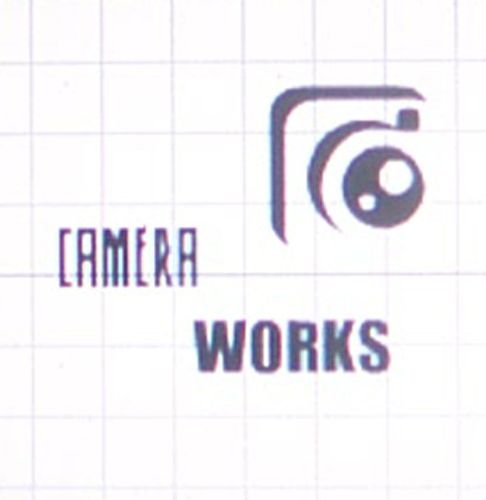
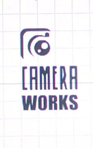
Now I will work on one for a photographer.......
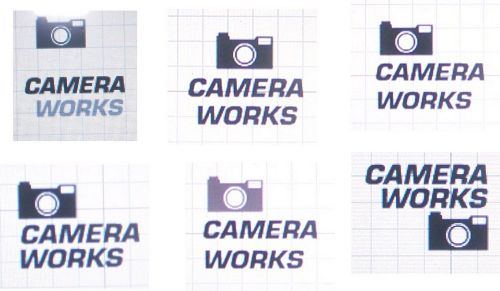
I start off with a simple camera image and a bold type face...then I start moving them around....you can do this with your computer but also with tracing paper....just put the type and image on one paper and slip it under the tracing paper...and trace different ways to use it.....works much better than having to erase all the time...
anyway I am not thrilled with any of them....so it's time to do another one....
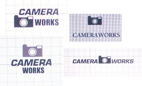
I like one or two of these better but I'm still not happy.....
i try something a little different....
using these elements i fool around some more and come up with this....
I like it but it's not quite there yet....
ta da....much better, well balanced and more interesting...
Just like any other piece of artwork it's hard to know when to stop......lol


