- Home
- Education
- Printmaking Pyrography Scratchboard
- Live Studio Scratchboard II

There are many ways you can color a scratchboard drawing. Just about any technique works and it's up to you to decide which material or method you like best for the drawing you are working on. Once you get the hang of it, it becomes like a fun shopping spree. You get to pick out which technique best fits which image. This demonstration is meant to show you my experience with trying different materials. The coloring agents I have used and know of are inks, acrylic, watercolor, gouache, oils, dyes, metallics, lustres, gold leaf sheets and gold crèmes. There are a lot of pictures in this demo and not that much text.
Whether to Add Color After Etching or During?
Scratchboard medium is mystifying and also more versatile than most people give it credit for. I've tried not to restrict myself to hard and fast rules like add color after all your etching is done. I don't think it works that way. Sometimes the best way to add color is in stages as you etch and as you go along. Color has value and intensity by itself and if you combine color over a greyscale that has its own value and intensity, you run the risk of canceling everything out. If you think only in terms of adding color AFTER, you might lose the whole effect you are shooting for, which is to have a dynamic drawing. I have done this enough times that I've learned to listen to the little voice that says, "Don't do it, think about it. Leave it alone."
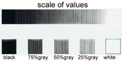
Remember the value scale from last time? See how if #1 is black and #10 is white they are very different? OK But as we get closer to the mid ranges, it gets closer, and there isn't as much difference between 6 & 7 as there is between 2 & 8. So if we were to add color OVER the close ranges, and the color is not the right value and it isn't transparent, we get the dreaded MUD all painters hate. Also, since scratchboard has hair thin lines, they are very easy to destroy.
To Color or Not to Color, There Lies the Question
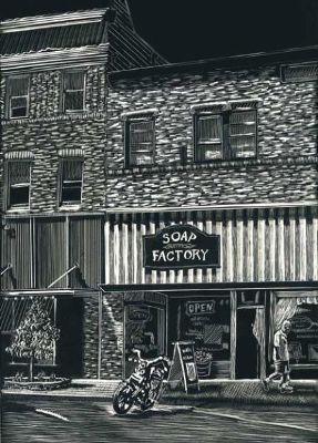
Here is a black and white that I would never consider coloring. It's one of drawings that works as a greyscale and I personally believe color would destroy it.
For a long time I could never understand why it seemed almost sacrilegious to color some scratchboards, and I think it might be because when you have achieved a good balance, you don't need to do anything more. Always ask yourself, "Will color make it better?"
This is called "The Soap Factory".
I think it's fairly safe to say that if you are working in close mid ranges, add your color as you draw and by doing so, you can "read" the values and maintain a good balance in your whole picture. Why? Because all values relate to each other; the values bounce off each other and they have a connection and relationship to each other. The north and south of your drawing not only talk to each other, they also talk to the east and west, etc. etc. This is a difficult concept to grasp and it's always a struggle to figure out the right thing to do. But that makes it fun too.
That is the hardest part of coloring scratchboard. The rest is easy.
I'll give a brief run through of the types of colorants that I have found to work well on scratchboard and then go to a step by step demonstration that has little or no text so you can watch a drawing develop from beginning to end.
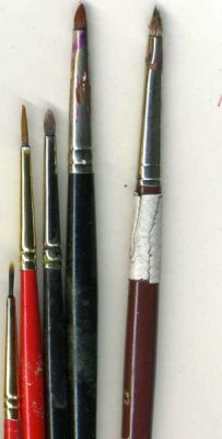
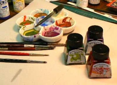
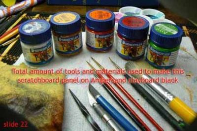
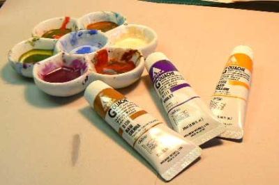
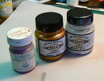
Tools and supplies needed: colorants, eyedropper, ceramic lotus dish, small brushes, some soft, some stiff. clean water, lint free paper towels, soft rags. Here you can see the sad state of my brush collection. But it does point out that you don't need a lot of brushes to make this happen.
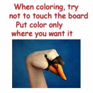
It's a good idea to try not to touch the scratchboard as the oil from your hands can mar the surface. Also, when you add any color, try to keep the color in the etched areas and don't put color over the black. Even if you think you can't see it, when you scan it and it is enlarged, you can see it.
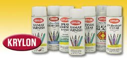
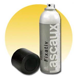
Other things you will need when you are done are sealants:
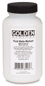
Fixative spray sealer, spray varnish, or cold wax medium (which you have to hand buff, but a great alternative if you don't like chemicals) I have also used Golden matte medium gel mixed with water and applied with a wide brush. I have not tried it but Pebeo makes a similar product. This type of sealant works well but it's really tricky to use because it can dissolve and blend the colors as you brush it on. For that reason though, it can give fantastic effects. But there is a risk without an airbrush. Experiment on something you do not care about with these sealants FIRST. Find out what you like and what you don't like. There are a wealth of products out there that you should test for yourself.
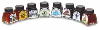
Inks with a shellac base
2 Recommended inks are: Winsor & Newton drawing inks are formulated from soluble dyes in a shellac solution. When you apply ink with a small brush, if they appear shiny, they might be too strong. Thin out with a drop or two of distilled water. Remember inks can be easily mixed in your lotus palette (violet=2 red drops + 1 blue drop etc) Don't be afraid to get the color you want in your lotus dish first and test out the intensity.
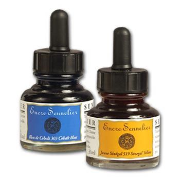
Sennelier Shellac Based Inks
These are real inks too and not an acrylic liquid transparent color. Colors are mixable with each other and with the thinner can be reduced for various techniques. Gold, Silver and Opaque White are great too. All colors are extremely rich, made with a shellac gum binder giving them a unique brilliance, brightness and vibration under light.
I want to show you this picture just as a reminder to use an eyedropper when working with inks. It's really important to have one and clean it out each time you leave a color so you don't contaminate your inks.
An Ink and Dye Story
Once, I colored a large and highly detailed scratchboard and framed it without glass, using an ultraviolet matte spray sealant. Luckily I did not sell it, but kept it for myself. By the time a year had gone by, almost all the color had gone right out of it. I had experimented and used liquid procion fabric dyes. (I had no idea what I was doing) That was the end of that experiment. I had to go back and completely recolor it which took a week. This time I used Winsor & Newton inks. The piece has not faded and has not seemed to have changed. That was 9 years ago so I think it's safe to say that Winsor & Newton inks are a good choice.
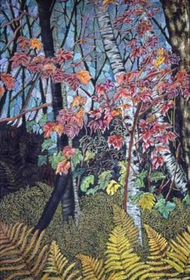
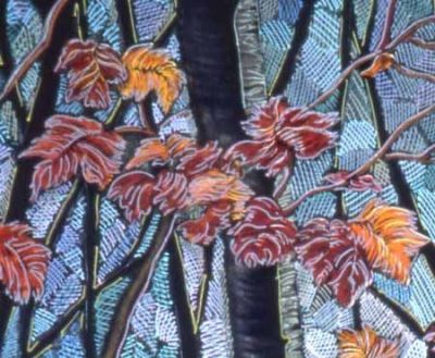
Autumn Leaves, Ampersand clayboard, colored with Winsor & Newton inks
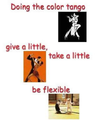
Doing the Color Dance
When coloring scratchboard, there is a little rapport going on between you and the art. Give a little, take a little away, give it back, scratch, take away, add one kind of color, then another, scratch out again, take some off, put some on. ⦠It goes on and on and on like this. It's like a little dance you do until you get it just right and know just when to stop. There are no hard and fast rules, I think to be successful with color, you have to be flexible and let it show you where it wants to go.
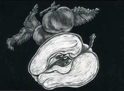
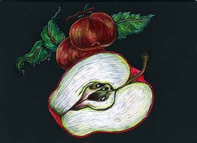
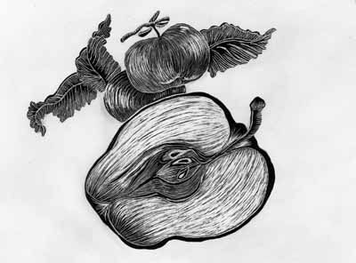
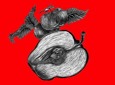
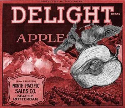
Apple Demo from Last Time we met
Last time we left off at the point where we could color the cut apple. We did two versions, one on black scratchboard and one on white scratchboard.
Here I've simply used colors right from the jars of Karat Liqua, red, a light green, brown for the stem and I used a thin application of white Karat Liqua white over the white scraped area. The addition of white makes the apple look real. I think it's because it takes that sharp graphic edge off and gives it an appealing milky and natural quality.
For the apple on black scratchboards I used Karat Liqua watercolor by Staedtler. I think they have a total of 9 or 10 colors, not many-- and you work with them in very tiny amounts. These watercolors have a lot of interesting qualities and are designed for the craft market and not for the fine art market.
I learned about these by trying a lot of different things, experimenting and creating a lot of extra work for myself. Butâ¦you never know what great stuff is out there until you try. They work well for scratchboard because the colors are rich and smooth, the paints never dry out and they contain beeswax. They have the consistency of pudding. You can thin them with a little water if you like. They blend wet into wet (but obviously not the same effect as wet into wet on w/c paper) On scratchboard when we say "wet" we are talking drops, small drops. You can't get your board wet like you would want to get a juicy sheet of watercolor paper wet.
When you are done, you can buff your board with a lint free cloth. Because of the wax in the watercolors, the board will develop a sheen and the wax will protect the color. I would recommend framing this technique under glass because even though the wax hardens over time and makes a nice sealant, it is still water soluble.
If you decide you don't like what you did, these colors lift off. It takes a very light touch to work with them but what I have found is they allow you to build up layers and do some nice glazing because they are extremely transparent. Even the darker colors are completely transparent which looks great on the white clay of the board.
Watercolors
Any good watercolor will work well if it is concentrated enough. Pan watercolors are more intense so they are a good choice. I like Karat Liqua for their versatility.
When you are done, you can buff your board with a lint free cloth. Because of the wax in the watercolors, the board will develop a sheen and the wax will protect the color. I would recommend framing this technique under glass because even though the wax hardens over time and makes a nice sealant, it is still water soluble.
In the white scratchboard version (I like it plain) but for demonstration purposes I thought it would be fun to color this in Photoshopâ¦â¦â¦â¦
Here I colored the background red. I just like to play sometimes.
You can do just about anything in Photoshop. Here, I put my apple over an old packing crate label that I colorized in another weird shade of red. This is a lot of fun.
Photoshop coloring
This piece "Candystore" started out as a black & white Ampersand etched panel. I scanned it to 300 dpi and colored it entirely in photoshop 6 and it took me 4 days because this is not my medium and I sort of struggled along, trying things out. It was a lot of fun and I think it has a kind of a bizarre, carnival type look to it. If I had colored it by hand I never would have come up with these color combinations. It's just an off the wall and fun piece. It has now become a giclee.

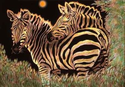
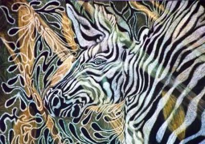
So was this next zebra one done in photoshop 6, "Lean on Me" started out in black and white, I did not like the results of the hand coloring that I did. It was etched in Essdee British scraperboard. I scanned it in greyscale (7000 X 5000 pixels) and got a shade of sepia that I liked. I then fiddled around, adding a foggy moon which I sort of stumbled on by accident. The coloring of the leaves was difficult but the whole project took quite a few days but I ended up being very happy with it. I like it so much better than the black and white and the bad coloring job I did manually the first time that it also is a now a giclee and these zebras are happy there.
Acrylic
I like these Golden acrylics. They are very nice texture and love the containers, you can only use one drop if you want to.
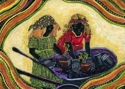
"Planting Time" is etched in Ampersand clayboard and colored with acrylics. The background is buff color acrylic. When it was dry, I applied a thin wash of Karat Liqua ochre over the acrylic and a little orange blended in around the girls. I left their faces and bodies blackâit was a risk but I had to have it not to lose the contrast. In the process I found a whole new style that I'm excited about. It reminds me of an old Russian folkstyle.
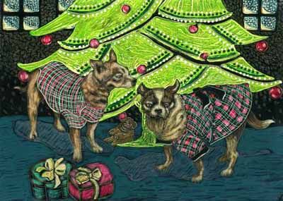
This is another acrylic coloring that was kind of daring for me because I was at the point of losing my values and at the same time, I had never dared to use so much paint on a panel. It is very different, and you have to look closely to see that it's scratchboard, but I love the acrylic textures. It's called "Chihuahua Christmas".
Gouaches
Acryla Gouaces are beautiful, but once they dry out they can't be rewet like regular gouaches, because they contain a little bit of acrylic. I like both and have used both.
"Hidden Zebra" was colored entirely in gouache. I would apply the paint, scrape some out and apply more. This piece was worked from a pencil drawing where I wanted it to be completely tonal and have no one value stronger than anotherâ¦to give you the feeling of camouflage and the hidden image.
Oils
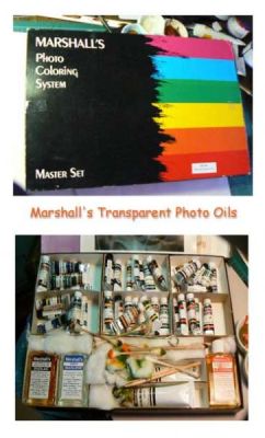
I have tried and I like these a lot. These are Marshall's photo coloring transparent oils. These are traditionally used to hand color photographs. They are transparent oils and give very beautiful color. Easy to blend. Work in layers. Glazing is good.
I'm trying them on different kinds of paper with a little tooth. They are beautiful. These are paints I will definitely spend more time with.
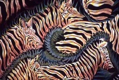
"Zebra Swirls" was done completely in Marshall transparent oils.
Metallics, Lustres, gold crèmes and gold & silver leaf
There are so many lustres, in liquid form and in powders. It's amazing how many great effects you can get with these wonderful paints. My favorite way to use them is very thinly. When you use them as a thin wash, they are transparent and the black of the board comes through for a nice effect. Remember when you use metallics and lusters the camera sees them as black and they are extremely hard to photograph.
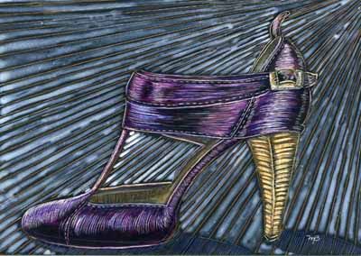
This Purple Prada Pump is etched in Ampersand clayboard black & colored with acrylic and the background is Lumiere purple, used as a medium wash. You can see the way it pools where it gets thicker.
This Dragonfly and Dandelion etched on Oasis silver foil scratchboard and colored in a combination of oils and Lumiere metallic blue
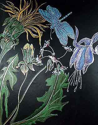
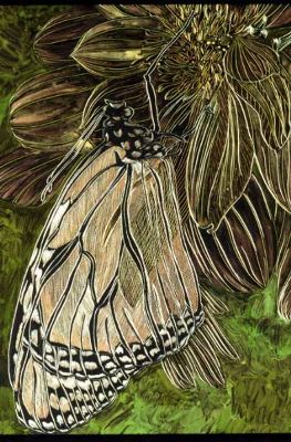
This Monarch Butterfly is etched in Oasis silver foil scratchboard and colored in a combination of acrylic washes and Lumiere metallic olive green and antique gold acrylic metallic paint used very thinly as a wash. The wings are very thin copper wash.
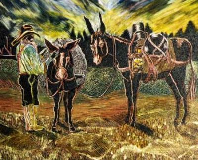
Gold Mining was etched on Ampersand clayboard, colored in pan watercolors (Winsor &Newton) and speckled with bright gold leaf as well as gold leaf powder (all the gold lays on the ground at their feet, which was a pun on this old-timer and his goldmining adventures with his mules)
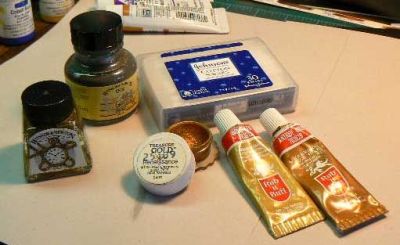
These are just a few of the colors available, there are also silvers and other shades of gold and other manufacturers, these are just samples. I use a compressed Qtip to apply the crèmes.
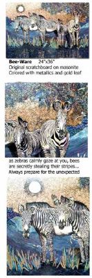
Bee-Ware took 3 months to draw and color. Because of its size it was very difficult to handle and there is a combination of gold leaf, gold crème, and all the other color is lumiere metallic in many combinations of colors of blues & greens and ochres. The sky was done in crèmes and the highlights were done in gold leaf. Leaf was applied in the tall reeds and grasses and over the sun. Gold leaf is very bright and shiny, but it's also flat and acts like an emergency brake in your paintings. Everything STOPS here the minute you hit gold leaf, your eye can't get out of it. So you have to use it very carefully.
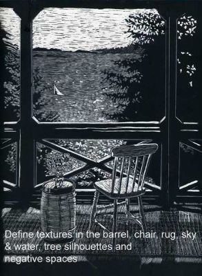
Combination of coloring Techniques
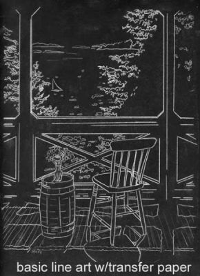
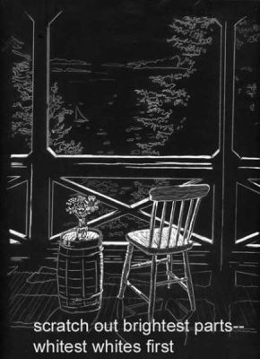
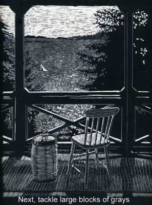
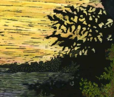
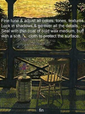
"Window Seat" is a very recent piece that I like to call happy family (from the mix & match Chinese stir-fry dish) because it mixes so many different coloring techniques, and yet it reads pretty much as a monochromatic. So here it is step by step from the very beginning.
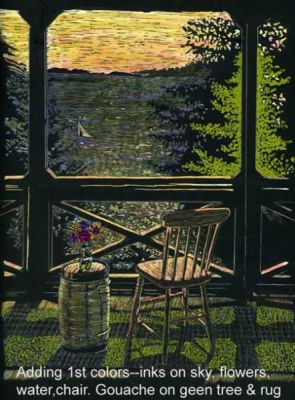
Actually, the sky was done mostly in oils, then I changed my mind and started working with inks. The flowers are almost fluorescent quality, a bright magenta ink. I added the bright green in front of the black trees because the area looked too dead and flat. Then when I had the green, I had to figure out a way to tone it down because it was just too bright. I was able to tone it down by applying Karat Liqua watercolor OVER the gouache. It turned out great. This is a good example of finding a balance as you go along.
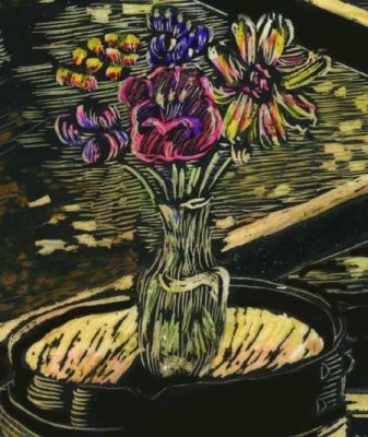
The flowers are done in Winsor&Newton inks.
When you add a new color, it's a good idea to spread it around the painting all over in spots. I call this "spreading the joy". Your eye relaxes when things are balanced.
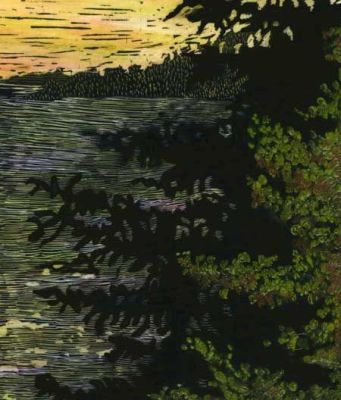
Close up of the trees on the horizon (textured by little dashes), the negative shapes of the evergreens (I found this was really hard to do) and I left some black in the sky to give the effect of a woodcut which I like the way that looks.
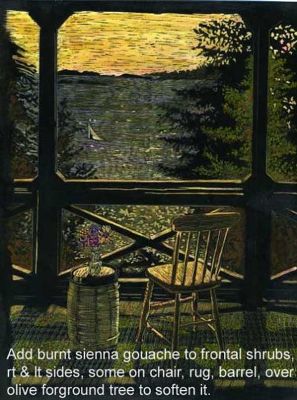
I applied karat liqua watercolors (oranges, reds and yellows) over the burnt sienna bushes and the green bushes. It puddled and made great textures. Went back in and scratched circles in the rug.
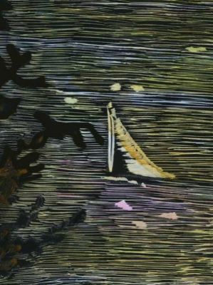
Here's the little sailboat on the River. The water has many shades of lavender, blues and yellows and the river is done in oils.
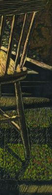
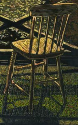
Here's the chair. I love the olive & burnt sienna gouache.
The chair is colored with karat liqua ochre and touches of orange and reds blended with a touch of the magenta ink on the footboards and highlights of the chair.
Naquaiya © 2007 - hands courtesy of: http://www.ezprezzo.com/index.html


